About Me
Hello! I am a housing analyst from Memphis, TN–now in New Jersey–who wants to help make housing more affordable, healthy, and safe. I use R to access, wrangle, and visualize data to better understand housing problems.
Portfolio
Rents and Incomes
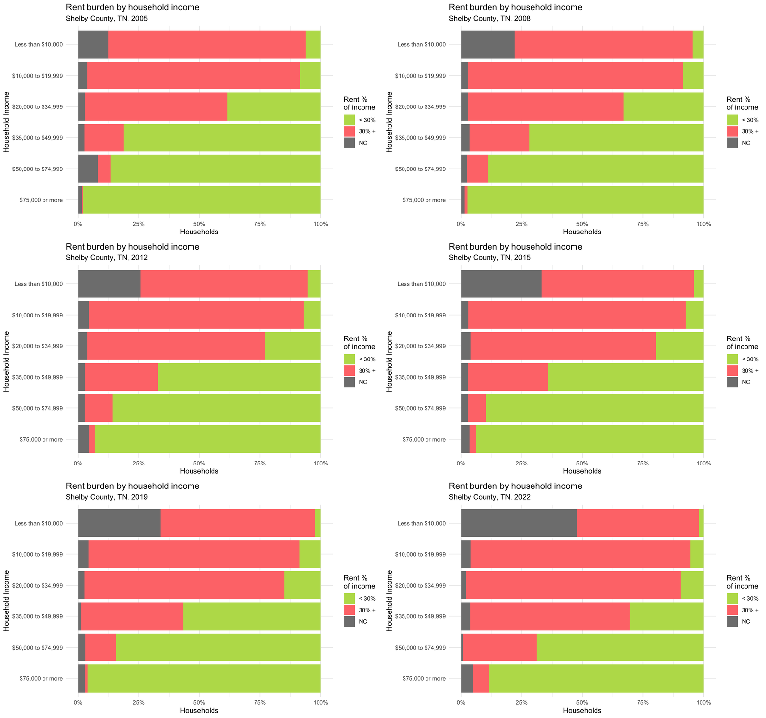
One way to observe the housing affordability problem is to look at how much of a household’s income is consumed by housing costs. The following graph breaks down housing burden (affordable = green; burdened = red; no income or no rent = grey) for renters in Shelby County from 2005 to 2022, using data from the ACS. Households are divided into brackets to display how this burden varies based on income.
Housing often leaves low-income households with a sliver of their total earnings, yet might be hardly noticeable to high-income households. However these households are not immune to the affordability issue, as more recent data shows that rent burden has also been increasing for households at higher incomes.1
Historical Redlining and Modern Distributions of Race
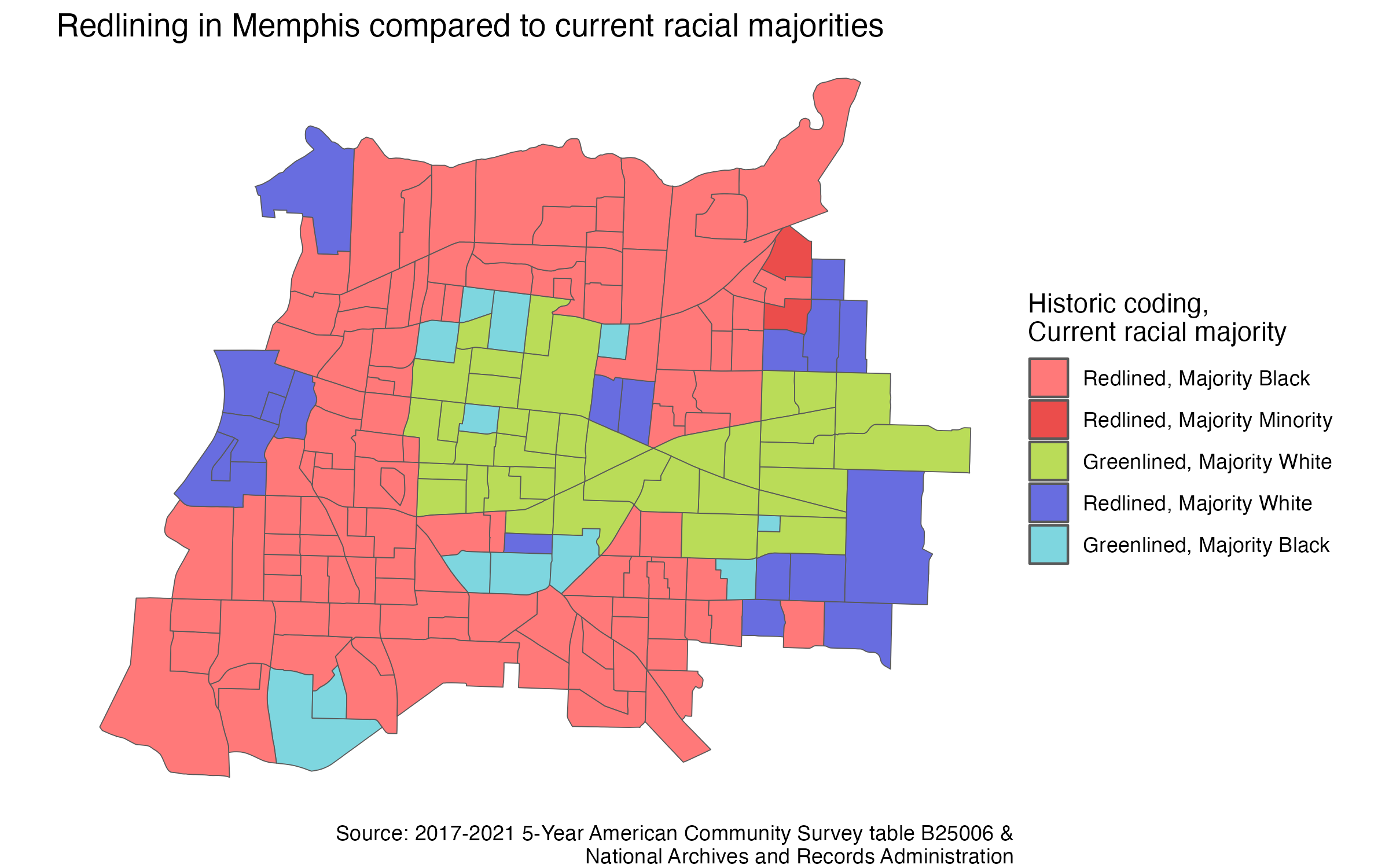
A few years ago I stumbled across a highly detailed redlining map from the 1930s which divided Memphis neighborhoods based on the perceived risk to mortgage insurers. I created a digital version of this map by editing polygons street-by-street, which I then joined with census block group geometries. I summarized the neighborhoods into “redlined” or “greenlined” categories, and then summarized census data based on the current racial majority of each block group.
Comparing the historical map and current data, I found that neighborhoods which were redlined are predominately non-white in the present day, and those that were greenlined are largely majority white. There are exceptions, such as areas in downtown and towards the suburbs which were redlined and are now majority white, and areas north and south of the center of the city were greenlined and are now majority black. This map alone provides incomplete information for additional discussion as it does not display incomes, housing quality, housing cost burden, historical racial composition, or homeownership rates.
Lead Paint Risk for Children in Poverty
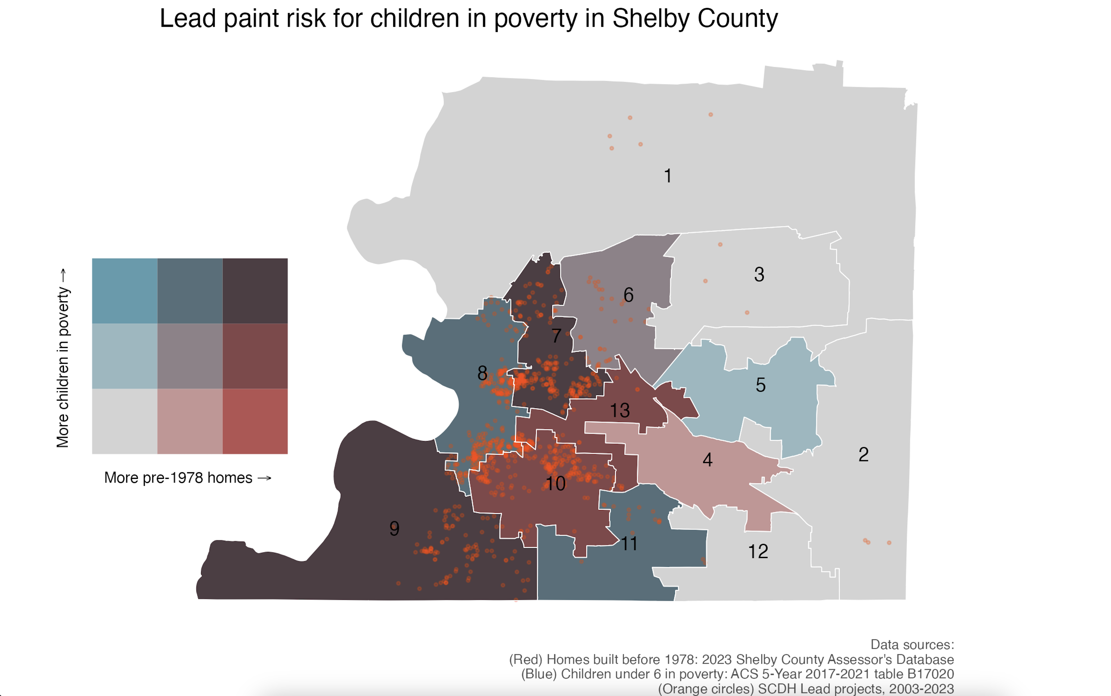
Homes built prior to 1978 are at risk of containing lead-based paint (LBP), which can be detrimental to the health and development of children who live in the home. LBP remediation is an intensive process requiring licensed contractors. Due to the risk and cost, the Shelby County Department of Housing (SCDH) offers a LBP rehab program for low-income households with a child under six. The following map shows the lead paint risk for children in poverty in Shelby County, based on Shelby County Commission District. Overlayed on the map are orange dots which represent LBP projects completed by the SCDH from 2003 to 2023.
Areas that are purely blue, like District 5, have a moderate amount of children in poverty yet few homes were built prior to 1978; conversely in District 4 we see is a moderate number of homes with a LBP risk, yet few households with children in poverty who would be eligible for the program. In the suburban districts there are relatively few children in poverty or pre-1978 homes. The remaining districts have a moderate-to-high mixture of risk and eligible households. By overlaying SCDH projects, we can see that the department has largely focused work in areas with a high need, though some areas like Districts 11 & 13 might be underserved.
This map combined four different data sources: shapefiles of districts, parcel-level assessor data containing the year built of residential homes, block group level ACS data which was interpolated to district boundaries using block-level population data, and internal address data for each project which was joined to the parcel data.
Website Example
I previously worked for a government home rehabilitation program. Contractors would often run into the same problems for the numerous documents required to participate in our program. Video 1 shows a website I created to make the information easy to find, including examples docs and how to acquire the documentation.
The website included: embedded presentations; example documents with assistance for each required document; tables which updated with the most recent internal data; and an interactive dashboard for current projects in our program.
Footnotes
This is not a full analysis. The graph only shows what percentage of households in each income bracket experience rent burden; it does not show how many households are in each category. Until recently, renting was relatively rare for higher-income households in Shelby County and there were very few apartments that catered toward this bracket. The increase in the supply and demand of higher-income apartments meant a greater possibility that some of these households would be cost burdened. Additionally, while looking at housing as a percentage of income avoids the need to adjust data for inflation, the y-axis still displays constant income levels. We would need to see total estimates to know how many people are being affected in each bracket, or perhaps adjust the axis to divide people into income quantiles.↩︎


